What Makes Bold
Interiors Livable?
A bold interior asks for attention. What does it give us in return?
The correlation
A bold gesture becomes livable through the decisions around it.
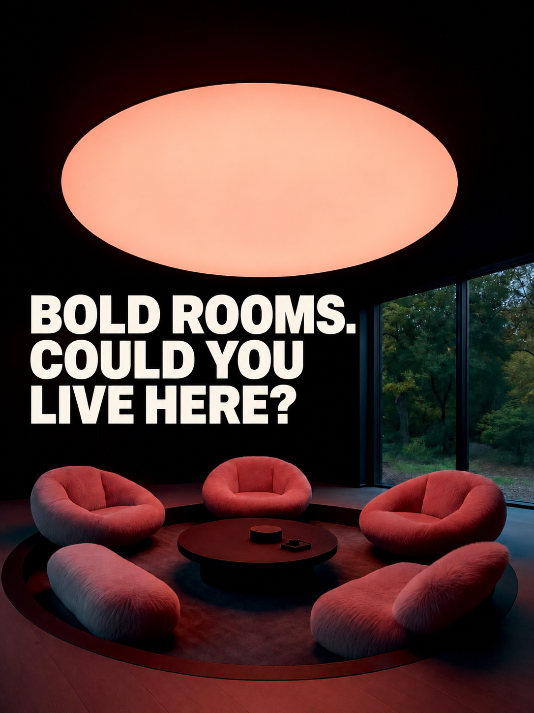
The first impression of a room can be dominated by one move: an enormous light, a saturated wall, deep shadow or an oversized pattern. Once we imagine spending time there, the supporting decisions become equally interesting. Where could we settle in? What gives the composition coherence? How much visual activity would we want around us?
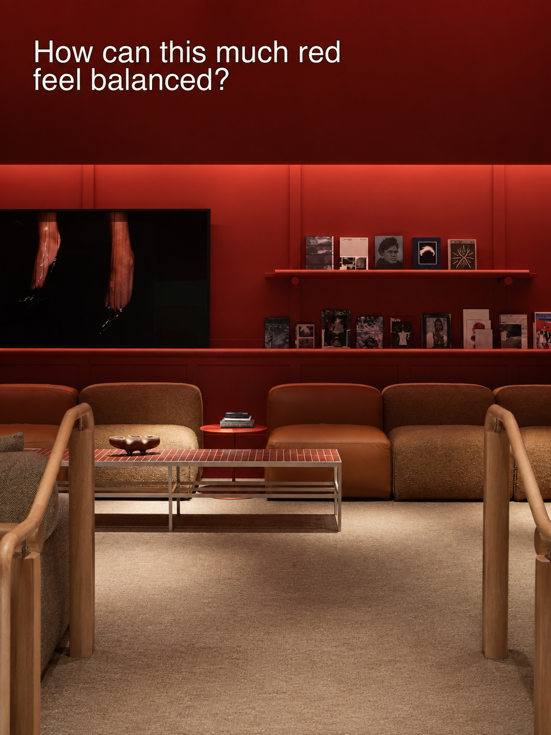
In the opening reference, low, enveloping seats give a monumental ceiling a bodily counterpart. At The StandardX, red continues across the wall and shelves; brown upholstery and repeated horizontal lines make that intensity feel composed. A strong statement gains from the relationships built around it.
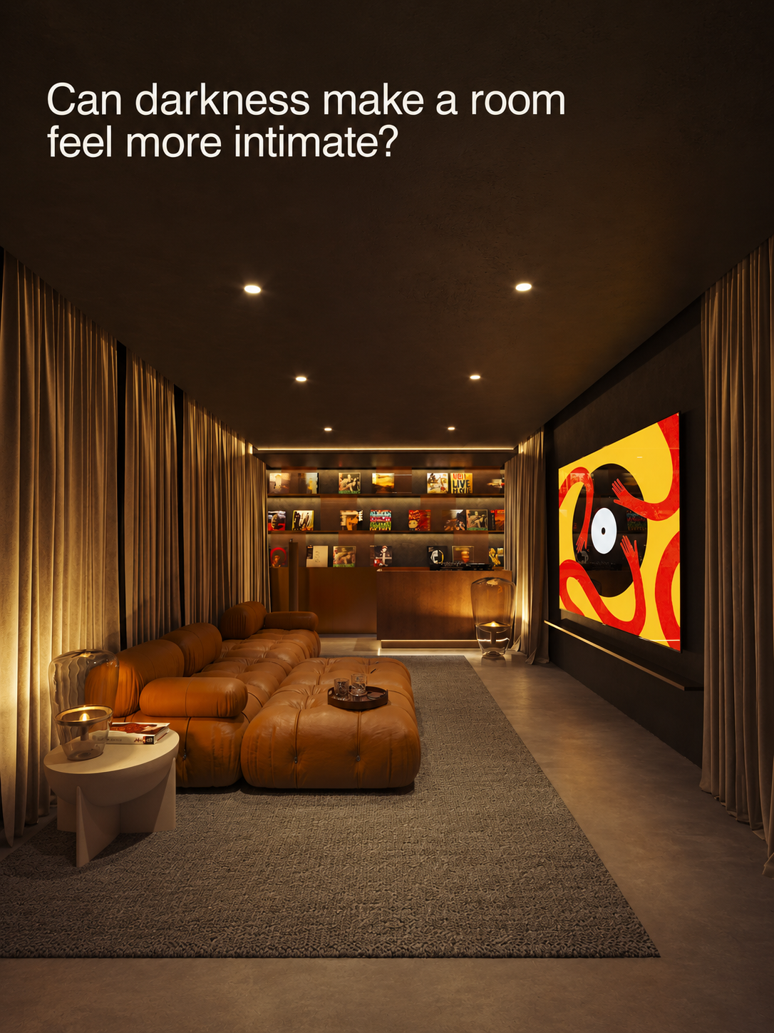
The Blakstad media-room visualization brings activity into the question. Dark surfaces, deep seating and warm pools of light suggest an enclosed setting for watching and listening. The atmosphere makes sense in relation to what someone might do there—and would need to be assessed differently in a room used for several activities throughout the day.
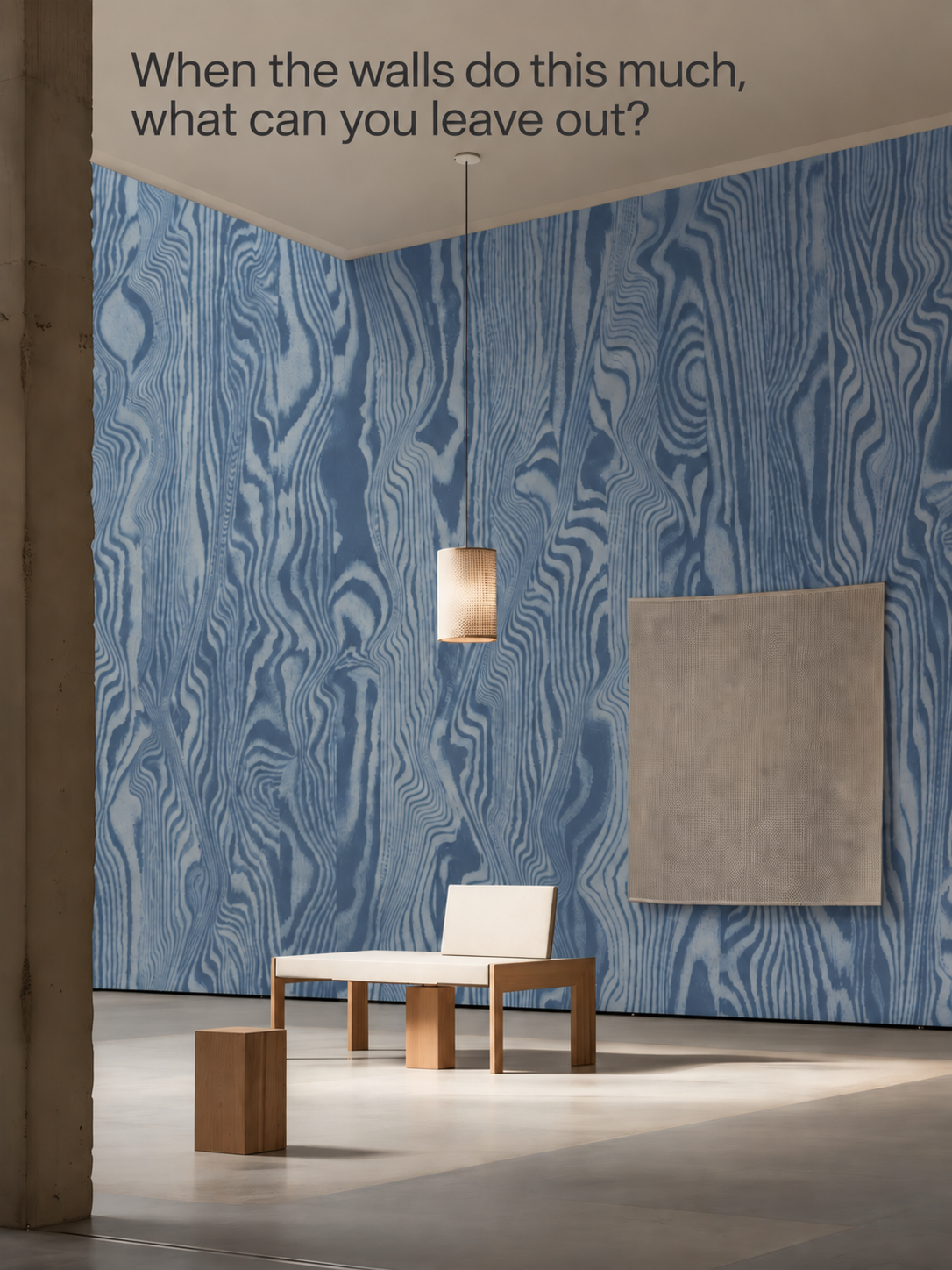
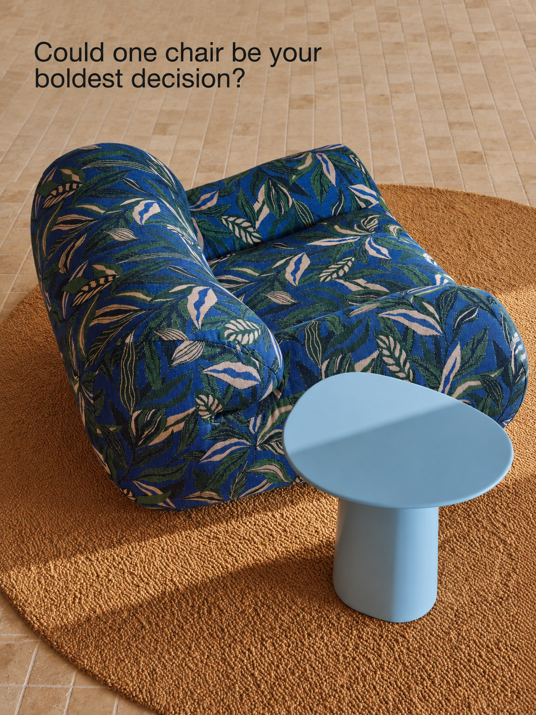
The final two references examine how much territory expression needs. The blue wood-grain mural occupies both adjoining walls, while plain furnishings and open floor allow it room. The Bon chair concentrates dense pattern in a movable object, with the neighboring table echoing its blue tones. Each offers a different scale of commitment.
For a designer, a useful way to read these references is to consider the bold gesture and its supporting decisions together. What would change if the seating became harder, the lighting more uniform, or the quieter surfaces equally patterned? Imagining one change can reveal which relationship is carrying the idea.
What would you want the boldest decision in your next project to contribute after the first impression?
References & credits
- 01Circular lounge
Design, original image creator, project and date — Unknown · Sharing source — HAWKSBEE · Image type — Unverified
- 02The StandardX, Melbourne
Interiors — Hecker Guthrie with The Standard · Photography — Shannon McGrath
- 03Cap Martinet residence, Ibiza
Architecture — Blakstad · Architectural visualization — creator Unknown · Interior styling authorship and image date — Unknown
- 04Vibrant Veneer Blue
Wall mural — belarteSTUDIO · Product presentation image · Image creator, date, interior creator and image method — Unknown
- 05Bon armchair
Design and manufacture — Jardan · Photography and image date — Unknown
Credits distinguish verified authorship from sharing sources and unresolved image-production details. If you recognize an unknown designer, photographer or image creator, please get in touch.